BLOG

SEASONS BY STUDIO FABIEN BARRERO+CARSENAT

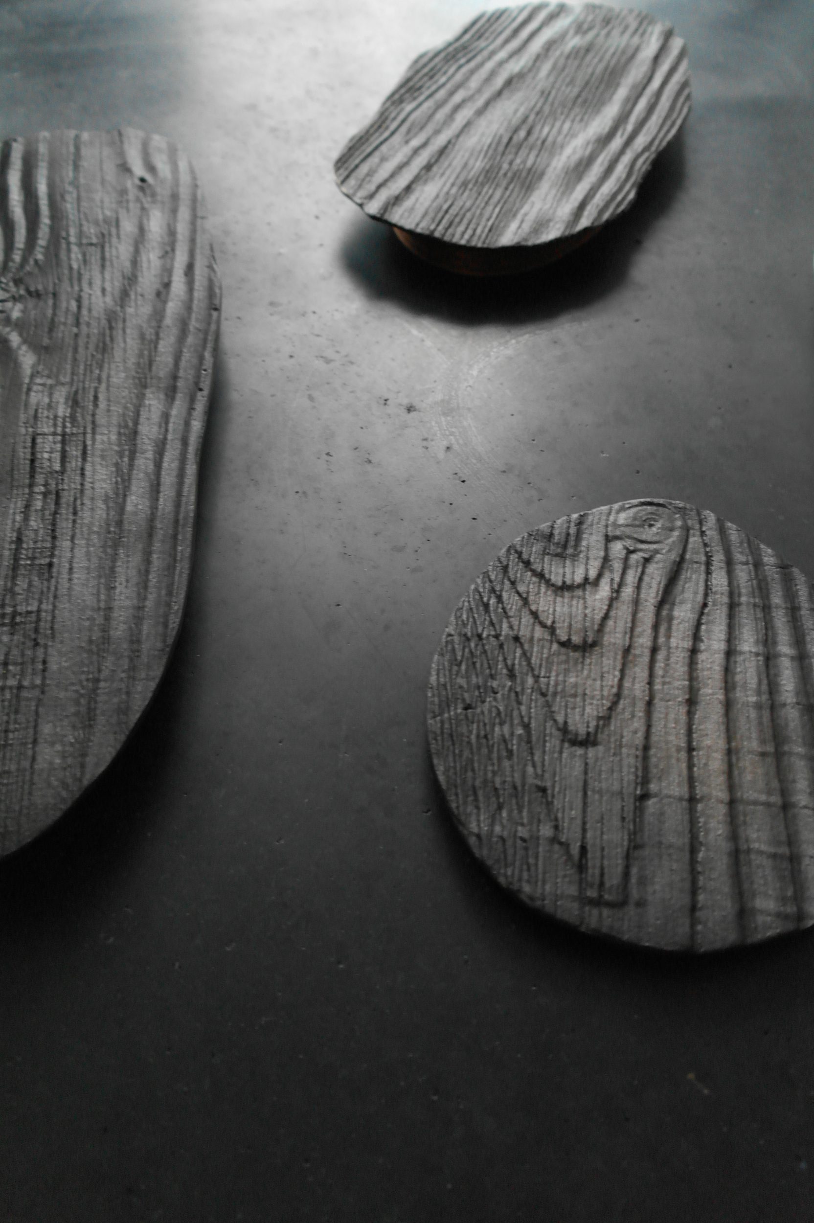
Seasons is a translation of a board which stayed over fifty years to rains and wind; time frozen in cast-iron. The objects with deep grooves and rounded shapes seems to be just found in the unimpaired nature that surrounds Studio Fabien Barrero+Carsenat. Aesthetic is found in the imperfection created by the forces of nature. Combining the heavy-weight, solid metal and the matte black color provides a stately effect. As a table center-piece, painted with pure hot bee wax and placed on a walnut wood ring, the time becomes exhibited in these ever existing pieces.

More info via e-mail

nox-16-hr

Seasons at OODE

————————–


Save

Save

Save

Save

VOIE LIGHTS BY SABINE MARCELIS

The ‘voie’ light series of Sabine Marcelis, is the result of an investigation into the manipulation of light-paths. Having chosen neon as the primary light source, the designed objects create an interception on the path the light follows through the addition of a singular extra material.

The addition of cast polyester resin diffuses the light path and in turn uses the light source to enhance the colour properties within the resin. A new moment is created when this mutually beneficial relationship is formed between materials, defining the unique properties of each where the two meet.

More info via e-mail

Sabine Marcelis - VOIE LIGHT

VOIE light series #1

———————

Save

Save

Save

CHIPPENSTEEL CHAIR BY OSKAR ZIETA

This beautiful out of collection chair with open back is made by Polish designer Oskar Zieta. They are part of the FIDU collection, that means inflating steel just like rubber toys. With one exception – objects created this way are not necessarily toys. Inflated steel sheets have a very high weight-capacity, so these funny looking shapes are indeed an innovative construction technology. Developed as a method of steel sheet stabilization, FIDU opens new possibilities of forming for the design objects and ultra-light constructions. This limited available chair is available at OODE for E 450, – in glossy black coating.

Order here

oskar zieta

Oskar zieta, Chippensteel glossy black at OODE.

———————–


Save

Save

Save

Save

TANNIC ACID BY STEVEN BANKEN

A rusty nail surrounded by blue stains in oak forms the basis of this research by dutch designer Steven Banken. Oak contains high concentrations of tannic acid, which turns into dark blue when it’s exposed to steel. The same happens with steel, as a result of a chemical reaction between red iron oxide and tannic acid. To accelerate this normally undesirable process the elements that cause this chemical reaction are applied in liquid form on the other material.

More info via e-mail

stevenbanken_tannic_acid01

Tannic Acid series of Steven Banken reveals the exceptional similarity in color of two radically different materials after the natural transition.

——————————-

Save

Save

LENNART BRAS, THE BLUEPRINT STATEMENT

Introducing Lennart Bras, ArtEZ Product Design class of 2016 graduate with a niche interest in the industrial production process and how one can simplify building principles. For a question in mind: ‘How can a production process bring forward a new readability for the user?‘, Lennard replies with his latest creation entitled ‘Bottom Up’, as part of his graduation project.

More info via e-mail

bottom-up-black-2‘Bottom Up Bench’ by Lennart Bras

Bottom Up‘ is a collection of products – shoes, a table, and a bench that unveils the manufacturing process, to be part of the design outlook in itself. The creative process featured thorough research and analysis of existing semi-finished products, readability, and focus on construction. ‘It’s all about the clarity of construction’, explains Lennart. For the ‘Bottom Up Bench‘, a traditional production process from an upholsterer was taken as inspiration, and applied from the legs of the product onwards. The result is Lennart’s way of smart construction thinking to show the inside-out of the manufacturing industry, from the bottom to the top.

bottom-up-black

‘Bottom Up Bench’ by Lennart Bras


_________________

Save

Save

ANGELE ETOUNDI ESSAMBA – PHOTOGRAPHER

essamba

​We have some orphaned art pieces of Angèle Etoundi Essamba. She was born in Douala and grew-up in Yaoundé. Her long and recognized trajectory in realization of photographical register of black women started in 1985 in Amsterdam. In her work, Essamba breaks from stereotypical representations of an Africa torn by famines, epidemics and wars, instead celebrating the cultural richness and diversity of the continent. Her outlook is equally aesthetic, idealistic, realistic, intimate and societal. Naturally, Essamba’s work joins the spirit of humanistic photography, and is strongly attached to the values of communion, solidarity and equality between men. Pride, strength and consciousness of African women and the relation between tradition and modernity is what one can see through Essamba’s colored and black & white photography.

————————————-

Save

Save

Save

Save

Save

Save

BALL CLAMP BY DIETER VOLKERS

Dieter Volkers is a designer from Maastricht, graduated from the ArtEZ Institute of the Arts in Arnhem where he is based today. His work space is the place to set his mind free, the place where he developed a series of functional, but also aesthetically strong objects. With his ‘Tools and Objects’ he knows how to attract attention to everyday products and acts. As Dieter explains:

“The products are the result of functional objects.
Objects which are powerful in their aesthetics.
My collection represents the actions of our daily lives.
Central is the value of ‘normal’ things and acts, such as passing a door.”

Present at OODE, is a piece of Dieter’s ‘normal’ things – the Ball Clamp. This opaque lamp looks like a squeezed ball with a clamp, to put wherever. The ball itself is open from the bottom,  to easily put a regular light bulb. A typical dutch design lamp – very useful and with a bit of humor. Available for purchase, also in the webshop.

Ball Clamp by Dieter Volkers

————————————————-

Save

Save

Save

Save

Save

Save

Save

PICTURESQUE MIRRORS BY TJIMKJE DE BOER

Interior and product designer Tjimkje de Boer is the brain behind designstudio Knapontwerp. Knapontwerp draws its inspiration from daily scenery and objects. Captured in photography, Tjimkje dives into detailed observation and poetic analysis of ordinary moments and taking the best of old crafts and traditional production methods, new ideas take hold and lead to the development of products.

Picturesque Mirrors by Tjimkje de Boer

 In such manner, a slushy paddle turns intoPicturesque Mirrors,   balancing on the verge of art and design as the reflective functionality is complemented by an interaction of lustrous colours. While across it, in collaboration with Anne Marie Twigge, the studio constructs a Converso Simplex, a minimalistic cube of a base and a loose interlocking element. This object tributes the physical posture in (public) speaking in various adjustable structures of formal and informal presentations. Offering the speaker all of the settings to present: seater, presenter, activator, highriser and converser.

dsc00822_orig-1
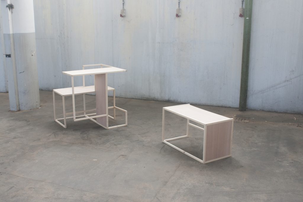
Converso Simplex by Tjimkje de Boer and Anne Marie Twigge

 Knapontwerp’s creations are focused on bringing both functionality and scenery to the indoors for personal use and fascination. All of the products are available for purchase on demand.


_______________

Save

Save

Save